Empty States
Implementing an empty state in your UI is an easily missed process, but one quite necessary to help users feel at ease with your product. Often when designing and testing your UI, you are concerned with how it will look like when it's being used and interacted with - but if there happens to be nothing to interact with, will your UI fail?
There is a lot of good content on the web about the significance of empty states, their practicalities and necessity, so I don't think I need to add too much more. I liked Meg Robichaud's article where she deliberates the need for quality design that only 2% of users are going to see.
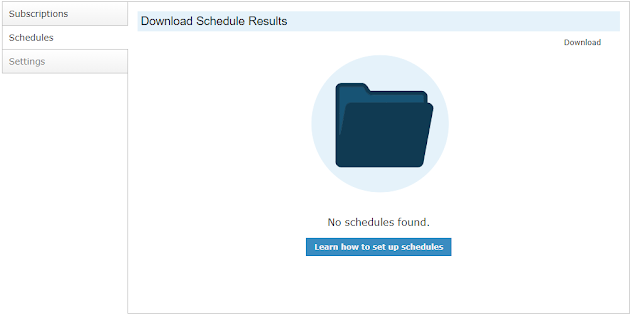
Suffice to say, that I had missed a good opportunity for an empty state in my initial design process, and then happened to run across an empty scenario myself. After the addition of a friendly icon graphic and useful to link to learn more, the application feels a lot more comfortable.
Shown below is by no means a polished design, but this is far better than what was before.
If you're searching for inspiration, hundreds of designs are only a Google away, but I always enjoy a browse through Dribbble.
There is a lot of good content on the web about the significance of empty states, their practicalities and necessity, so I don't think I need to add too much more. I liked Meg Robichaud's article where she deliberates the need for quality design that only 2% of users are going to see.
Suffice to say, that I had missed a good opportunity for an empty state in my initial design process, and then happened to run across an empty scenario myself. After the addition of a friendly icon graphic and useful to link to learn more, the application feels a lot more comfortable.
Shown below is by no means a polished design, but this is far better than what was before.
 |
If you're searching for inspiration, hundreds of designs are only a Google away, but I always enjoy a browse through Dribbble.

Comments
Post a Comment