Posts

Celebrating Female Mathematicians

Image
It is sadly unsurprising that the number of women in Mathematics is so low. It's a field that has remained dominated by men (and predominately white men at that) since it's inception. But today Google honours Olga Ladyzhenskaya in their Google doodle. I am somewhat ashamed to admit that I had not heard of Ladyzhenskaya before today. This was a particularly a surprise to me as she worked in fluid dynamics, an area of mathematics that I have a particular interest in. I am grateful for the reminder to be celebrating women in science and to take an active interest in the work of women leading in their fields!
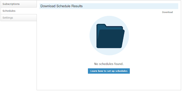
Empty States

Image
Implementing an empty state in your UI is an easily missed process, but one quite necessary to help users feel at ease with your product. Often when designing and testing your UI, you are concerned with how it will look like when it's being used and interacted with - but if there happens to be nothing to interact with, will your UI fail? There is a lot of good content on the web about the significance of empty states, their practicalities and necessity, so I don't think I need to add too much more. I liked Meg Robichaud's article where she deliberates the need for quality design that only 2% of users are going to see . Suffice to say, that I had missed a good opportunity for an empty state in my initial design process, and then happened to run across an empty scenario myself. After the addition of a friendly icon graphic and useful to link to learn more, the application feels a lot more comfortable. Shown below is by no means a polished design, but this is far better

Effective Form Design

Image
Following from my previous blog, I have been considering the design of my form. I read this article  on the this topic that I had come across previously and saved for later reference. To my horror I realised I had fallen into some bad design habits that ultimately make forms less intuitive and user friendly. This was my previous design: It is a newsletter sign up for that appears as a footer. I'll be honest that I hadn't spent a lot of thought into the design (aside from a handwriting style font). Placeholders vs Labels -   So, it turn out using placeholders instead of labels in an attempt to save space is actually a bad idea. This article explains why  Placeholders in Form Fields Are Harmful . Descriptive CTAs - Rather than a bland and uninformative 'Submit' button, inform users what they are doing! Indicating Required and Optional Fields - It is not usually necessary to have an asterisk (*) next to every field that is required (as most fields are, you

Eliminating Spam in Modx Forms

Image
I've been trying to find the optimal system for reducing the number of fake leads being generated in Salesforce. Salesforce has a useful tool for generating a Web-To-Lead form which was the template for what had been used on the site so far. There were also a bunch of inline script for form validation which would prevent the form from submitting if fields were not completed (using event.preventDefault()). I looked into Google's reCaptcha , which, with the latest v3, blocks spam submissions without adding any annoying test for the user. reCaptcha v3 eliminates the reCaptcha v2 element that requires users to tick a box before submission So, the goal is to create a Modx form that submits to Salesforce and supports reCaptcha v3. This turned into a three step process: 1. Using FormIt for form validation FormIt was already installed and in use in other places on the site. FormIt provides a simpler way to validate forms, rather than having the write JavaScript to check

Symlinks and Static Resources

Image
Symlinks What are they? The ModX website describes symlinks as below: "A MODx Revolution symlink simply takes the content of one resource and displays it in another." This means you can have two different urls that display the same content. Why use them? The more I used ModX the more I found getResources really useful. It took a while to wrap my head around it at first, but, once I did, I discovered it can be used as a useful to display a variable amount of content. For example, I have a page with various cards - when you click on a card a modal pops up with particular details depending on the card you picked. I wanted these cards to be easily customisable, and not be restricted by the number of template variables I code in. I created a template which would be the main page. I then created a template which would be used for each of the feature items - this was mainly to hold the template variables I would need. But now I have a new document for each o

One Template For Every Page (almost...)

I've recently been working with Modx Revolution 2.5.1 to redesign a company website. It was an existing site so a lot of the structure was already there. But I wanted to create a really flexible design so that whoever was using my templates would be able to completely customise the page, ensuring the site has a continuous global feel but so not every page was indentical in layout. Most pages would use a standard layout template for content, with a few pages using different templates for things such as news posts, documents and resources, and contact forms. The standard content template is comprised of "sections" - some are always displayed and others can be enabled or disabled. Enabling and Disabling Chunks Each of these content sections is written in a chunk. I can throw that chunk into the template and it appears great. I use template variables associated with each chunk (keeping everything ordered in categories) so that the text that will appear on the site is ea